Design Through Space and ShadowOct 18, 2024

In this fourth journal entry, we are excited to share the story behind the creation of the YORUYA logo, as well as the room signs that give each guest room its own unique character.
The logo and room signs for YORUYA were designed by Shota Urakawa, a graphic designer working under the name “omote.” His work spans a wide range of graphic design, from print media to shop art direction, with a particular focus on the written word.
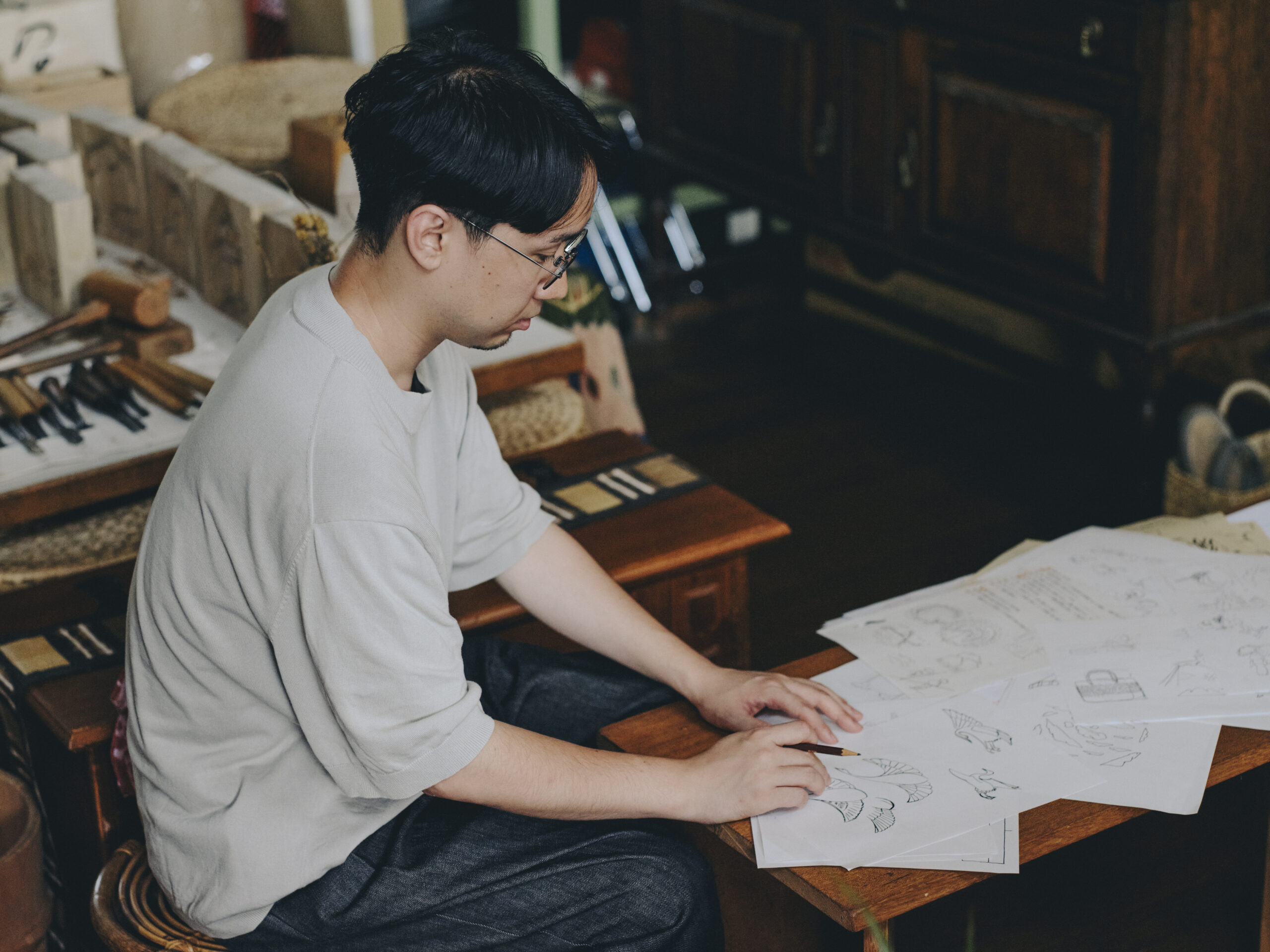
With his long experience working with language, Mr. Urakawa approaches design with an emphasis not only on surface-level beauty, but also on unseen aspects, such as outlines and surrounding elements. He strives to create designs where the visible “omote” (front) and the invisible “ura” (back) exist in harmony, ensuring a balanced and thoughtful aesthetic.

When brainstorming the logo for YORUYA, Mr. Urakawa immersed himself in books published by Okayama Bunko, a publisher known for its works on the local history and culture of Okayama. As he retraced the cultural shifts shaped by the people of Kurashiki throughout its history, he began to envision what the logo—the “face” of YORUYA—should embody. He decided on a logo design that intentionally leaves space for interpretation, allowing guests to imagine and find their own meaning in it. At the heart of the design is the symbol of a thread—a nod to Kurashiki’s identity as a textile town, and to the meaning of the word “yoru” (to twist or intertwine) in YORUYA’s name. In creating the logo, he twisted real threads into a rope and used this as a stamp. The result is a logo that evokes different images, such as a flower bud or a standing human figure—a logo that is not too rigid or overly formal, but rather conveys a warmth and texture that could only come from being handcrafted.
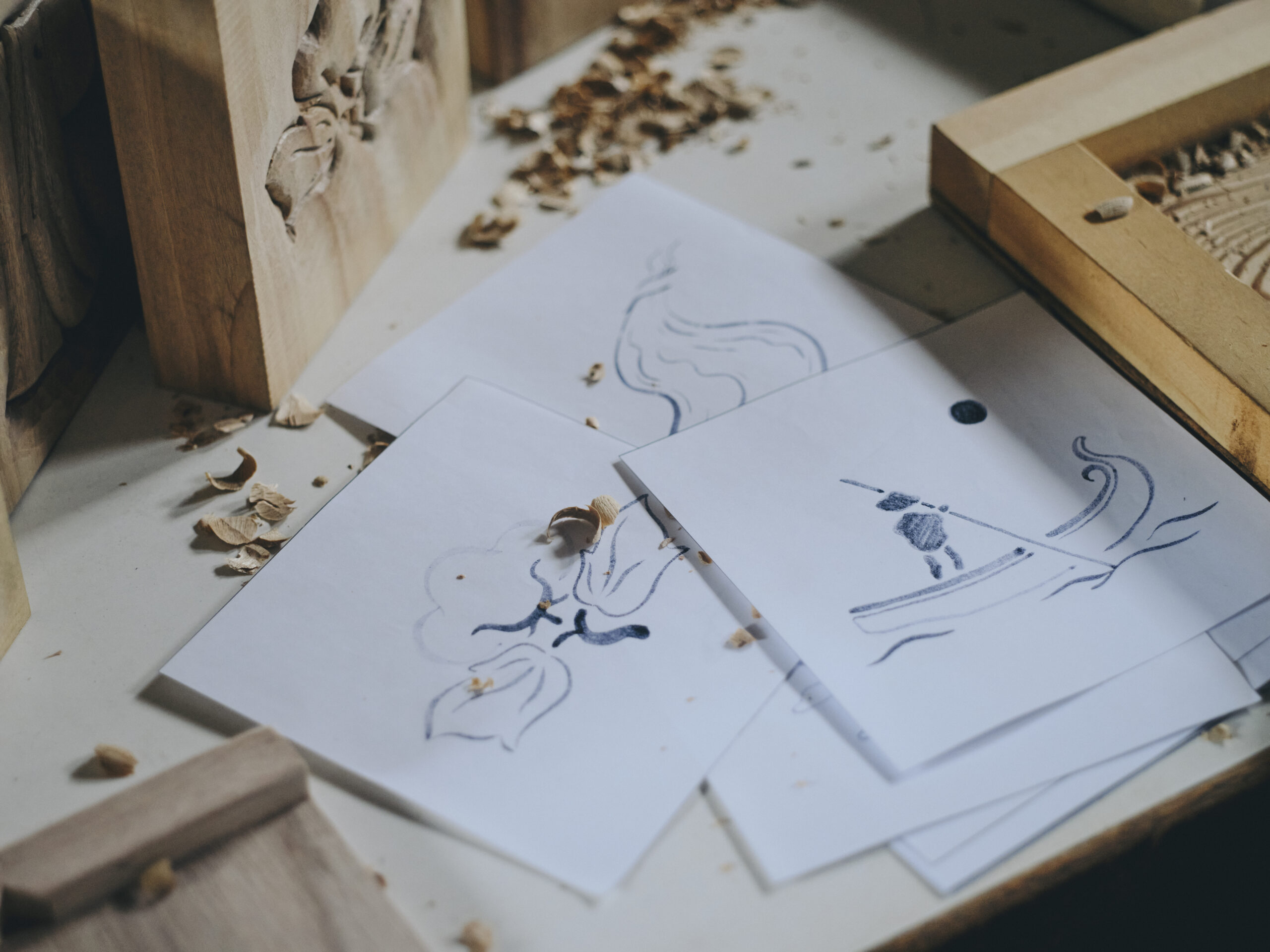
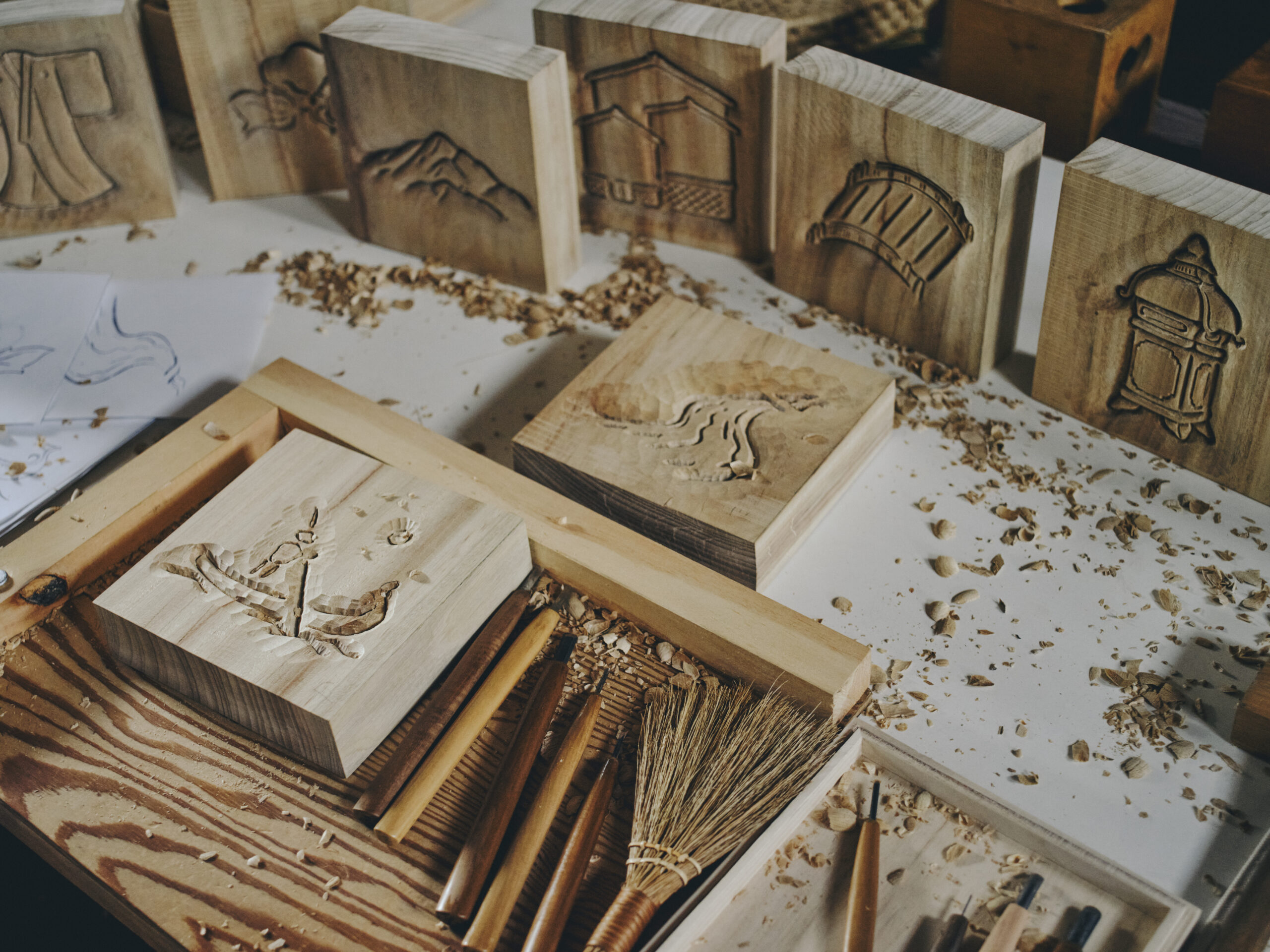
The wooden carvings used for room signs were created by Mizuki Takayama, who, after completing her master’s degree in sculpture at Tokyo University of the Arts, pursued a career as an artist. Ms. Takayama questioned the theory she learned during her university years, which stated that “sculpture should not be craft, and artists should not become craftsmen.” She has since become more interested in creating sculptures that serve a purpose and seamlessly blend into daily life.
The creation process began with Mr. Urakawa sketching the motifs, which Ms. Takayama then used as the basis for her carvings. Initially, the designs were simplified to ensure ease of carving, but as their discussions progressed, Ms. Takayama suggested that rather than streamlining the designs for practicality, they should embrace the imperfections and texture that come from handcrafting. This approach allowed them to add more intricacies to the designs, capturing the essence of handmade artistry.
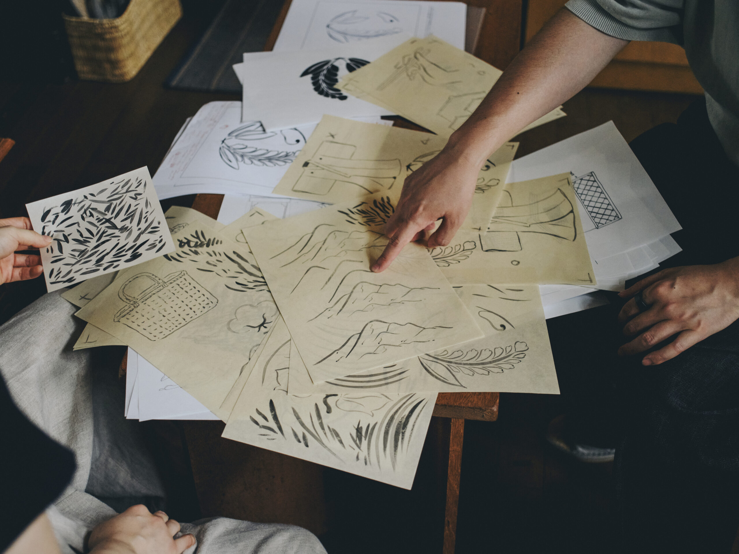
When we view two-dimensional artwork, our eyes tend to focus on the outlines. At first glance, Ms. Takayama’s carvings appear to emphasize these lines, but as she explains, it is the depth and slopes around the outlines that create “shadows” which, in turn, bring out the shapes that were never explicitly drawn. This technique gives the carvings a sense of dimension, where the interplay of light and shadow breathes life into the design.
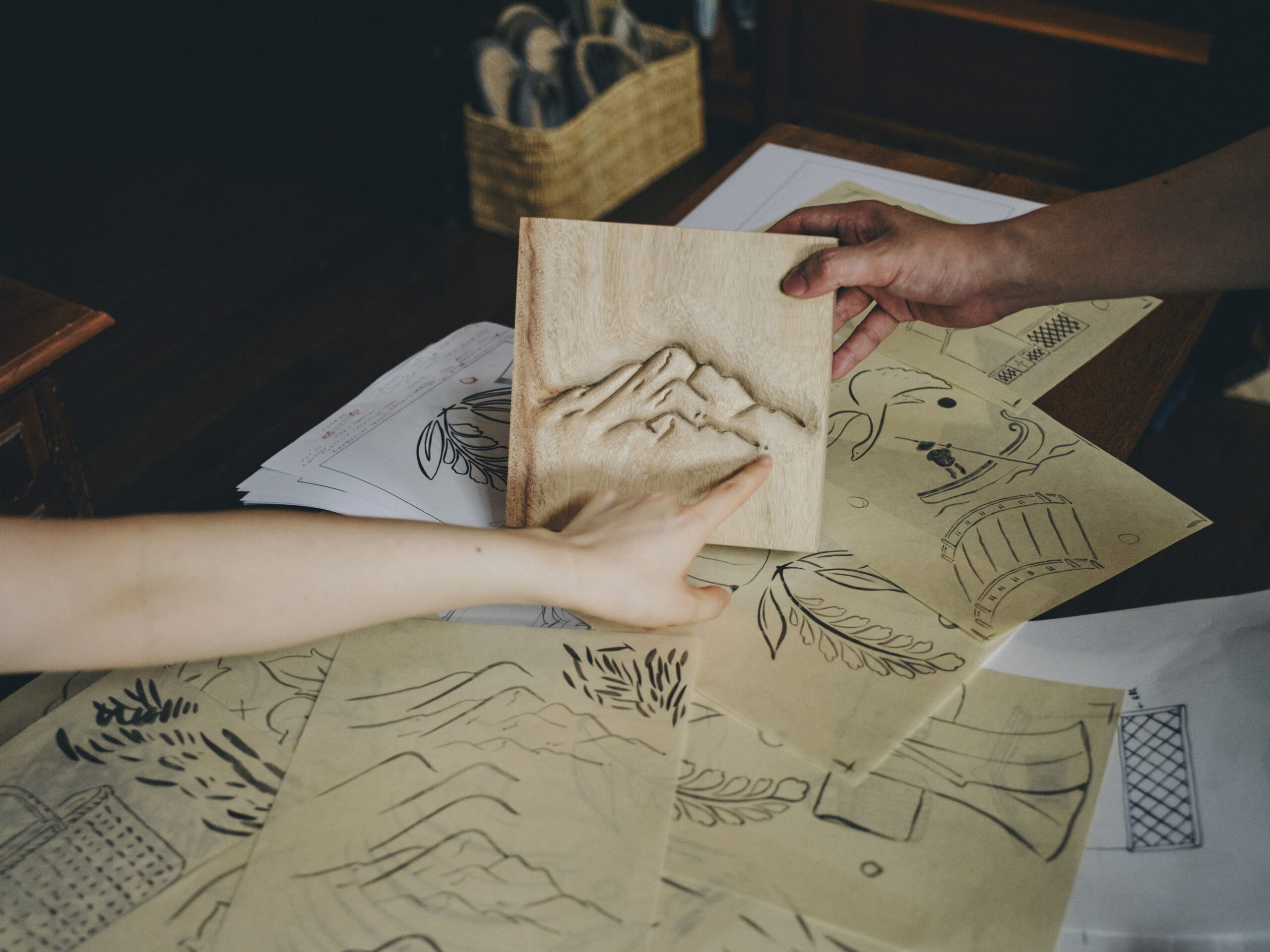
A phrase that stuck with us during the creative process was, “it is better when things are not overly rigid.” Though design and sculpture may seem unrelated at first, the continual dialogue revealed a common thread between the two—both artists valued the act of “kaku” (to carve, to draw), whether it is drawing a line, sketching an image, or carving wood. Both artists expressed a desire to blur the boundaries between these forms of creative expression.
During the creative process, the YORUYA team threw around a mix of random, abstract ideas to inspire the design direction—such as “the softness of plants,” “the asymmetry that reveals human craftsmanship,” and “the fusion of old and new that defines Kurashiki.” Through Mr. Urakawa and Ms. Takayama’s creativity and craftmanship, these concepts were translated into tangible elements that have added new layers of character to YORUYA. Grounded in a respect for history and technique, they have breathed new life into YORUYA, producing works full of warmth and charm that reveal themselves not in sharp lines, but in their subtle, blurred contours.
Edited by Yuya Uenuma from YORUYA
Written by Keiichi Asakura


